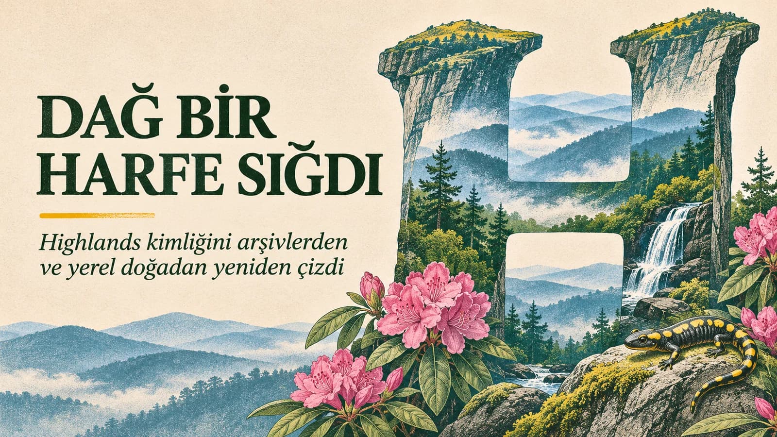
When branding a town, the easiest path is to turn its most recognizable landscape into a logo. The hardest part is doing so without making it look like a tourist badge. Matey studio's new visual identity for Highlands, North Carolina, seeks a balanced solution between these two extremes by placing the Whiteside Mountain silhouette inside the town's initial letter, H.
The system, developed for Visit Highlands and the local chamber of commerce, does not just propose a new logo. It builds a broad language that can be used across different touchpoints of the town, with letterforms drawn from archives, icons depicting local plants and animals, and a color palette that carries the tones of mountain mist and forest.
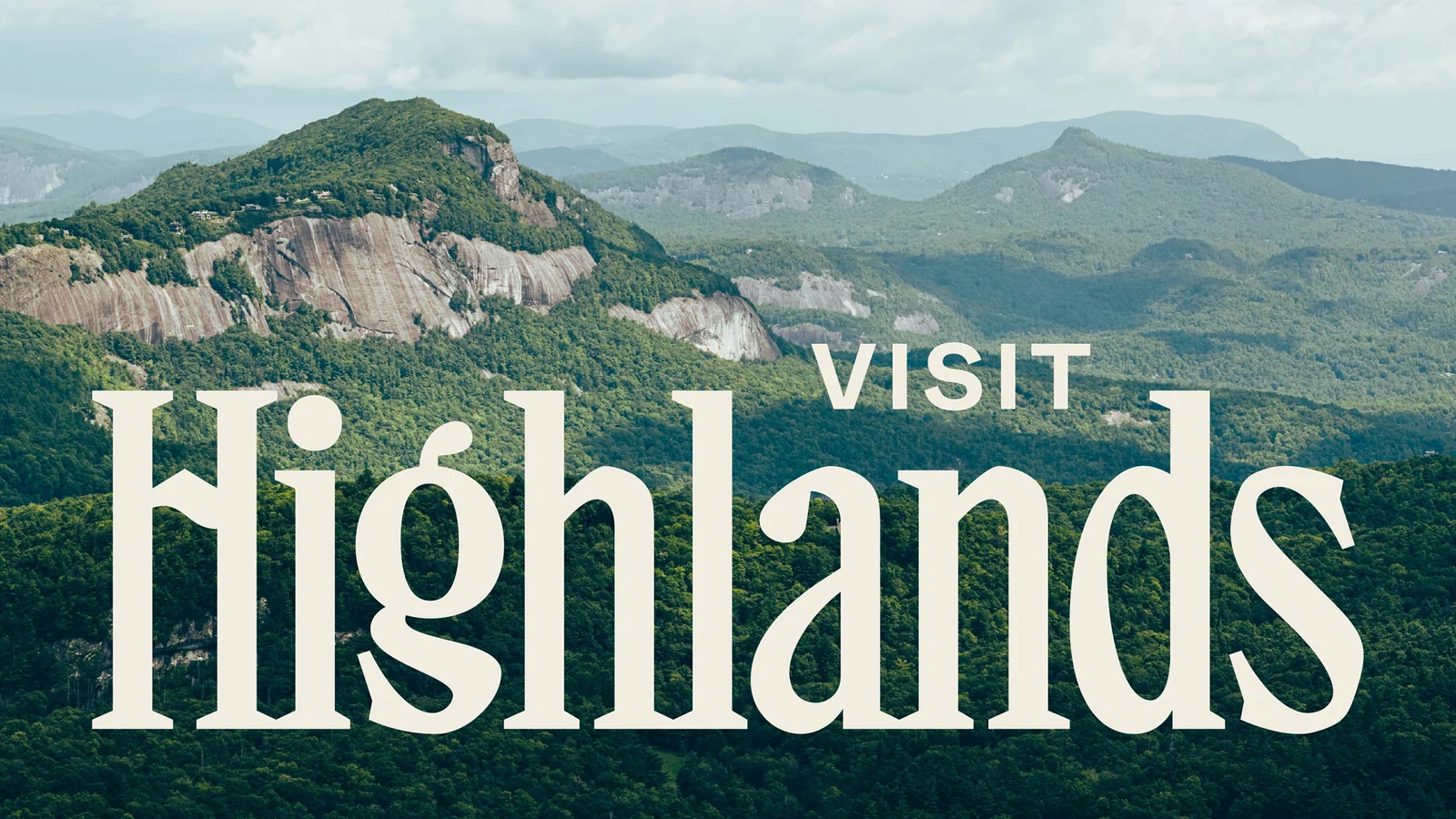
Letter and geography on the same line
The H at the center of the logo is shaped by the distinctive rock line of Whiteside Mountain. The mountain shape is not an ornament added on top of the letter; it becomes the main movement that connects the two vertical stems of the letter. Thus, the mark gives a sense of landscape before reading the name; when you see the town's name, the geographical reference is completed.
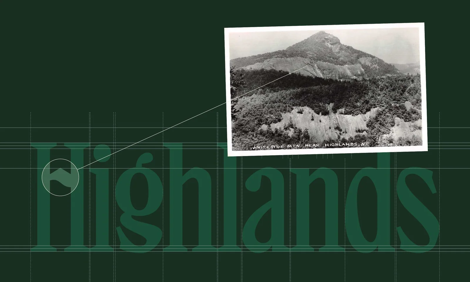
Matey consulted old writing samples in the Highlands Historical Society archives while establishing the typographic language. The aim here is not to copy the past as is. It is to adapt the character seen in local signage and documents to contemporary usage needs. As a result, the identity leans on the town's memory without trying to look nostalgic.
Nature is not just about green
In place branding, nature is often reduced to a single shade of green. The Highlands system expands this shortcut: forest greens, misty blues, earth tones, rhododendron pinks, and gold tones are used together. Thus, the palette can carry both the region's variable weather and its plant diversity.
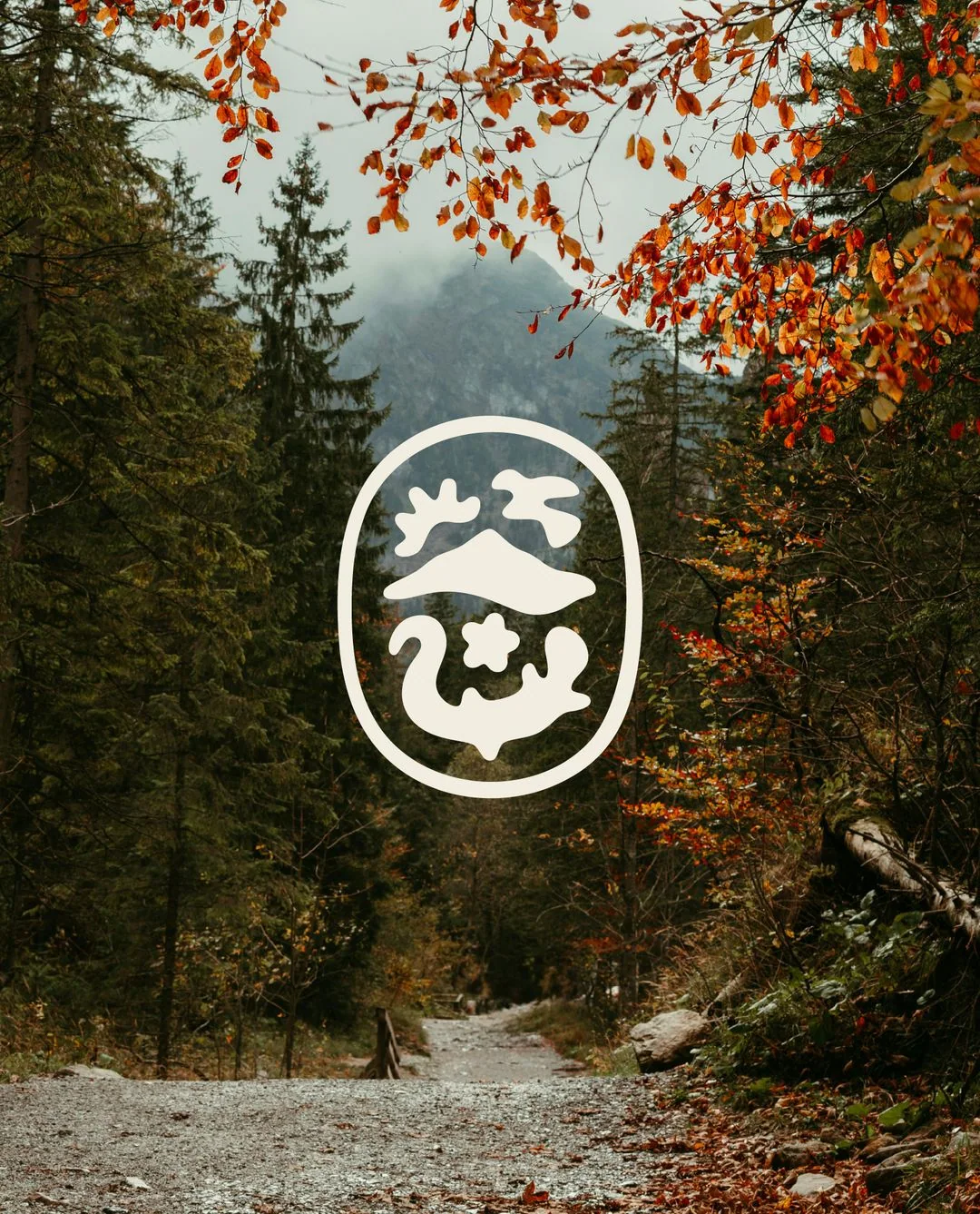
The icon set includes a mountain and sunrise, as well as a migratory bird, rhododendron, and a salamander native to the region. These small marks make the identity flexible not only in visitor brochures but also in wayfinding, events, products, and digital communication. Instead of constant repetition of a single symbol, different parts of the same geography speak.
The question of representation in local identity
The strength of the new system lies not in rejecting the "mountain town" cliché entirely, but in elaborating it. Highlands' mountains are certainly central, but the identity does not just sell a landscape viewed from afar. Archive, vegetation, animal life, and local typographic traces come together in the same system.
This approach reduces the interchangeability problem that tourism communication often falls into. The logo cannot easily be attached to another mountain town's name because the mark is tied to a specific mountain's line, the icons to a specific ecosystem, and the letterform to the local archive. In place branding, originality often comes not from a brighter emblem but from truly looking at the place.