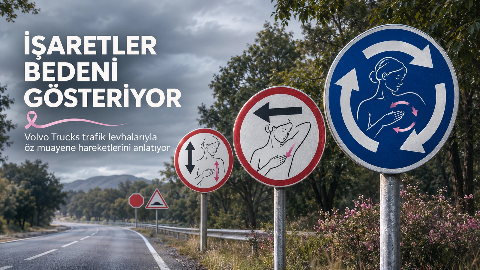
Three arrows on an intersection sign tell the driver which way to go. Volvo Trucks and Chilean agency Fenómena read the same signs this time as a circular hand movement. The six-poster series, created for Breast Cancer Awareness Month in October 2026, turns traffic signs into a short visual guide drawing attention to breast health.
The brand connection is clear: Volvo Trucks speaks from the safety space. But it doesn't limit safety to hazards on the road; it carries the warning language everyone knows into a call to notice changes in the body.
The sign doesn't change, the reading does
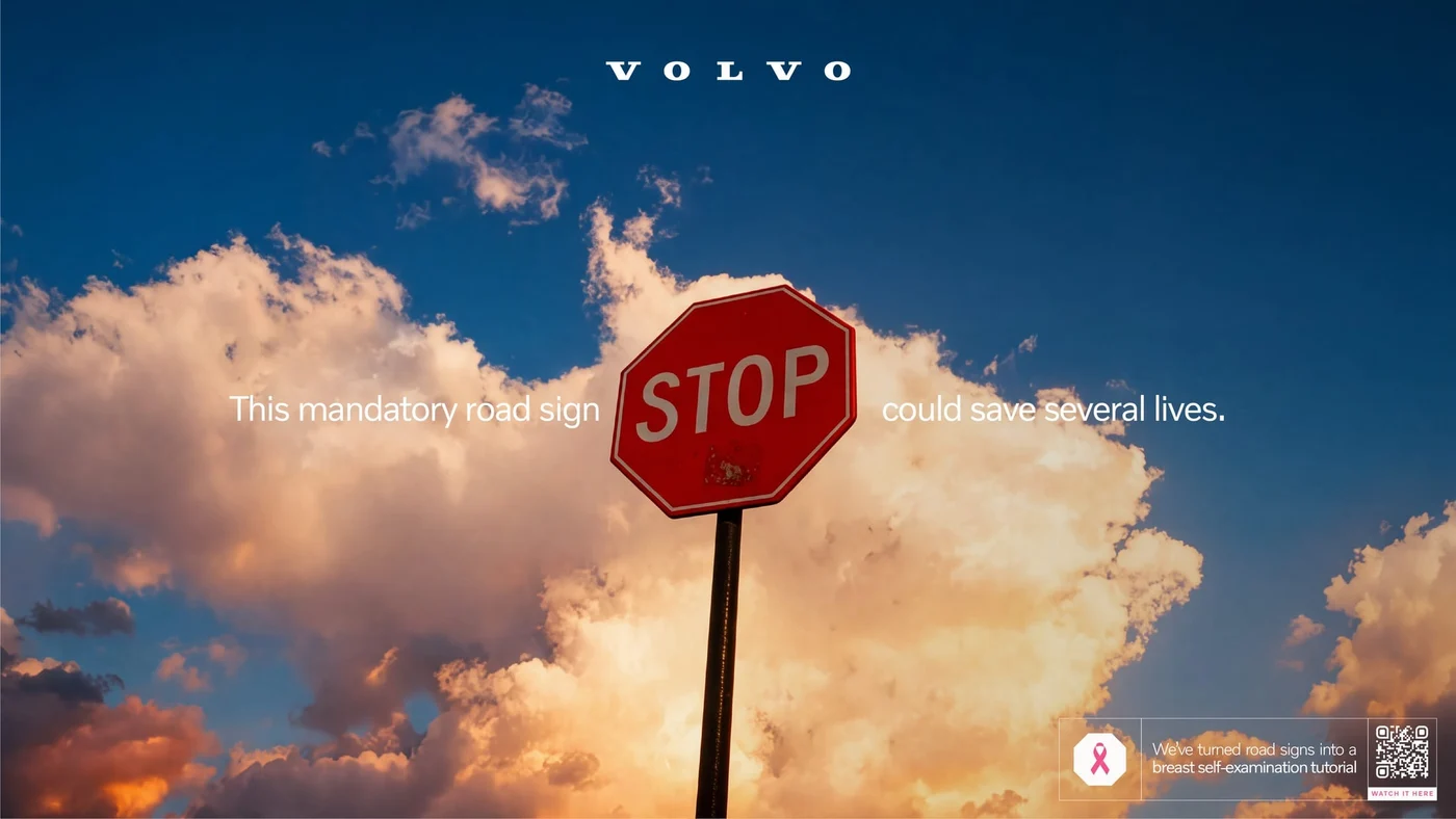
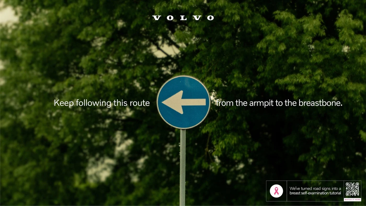
The campaign doesn't alter the shape of the signs. The roundabout arrows describe the hand's movement around the breast; the left-pointing arrow, the line from the armpit toward the breastbone; the two-way arrow, the up-and-down movement. The explanatory sentence is split on either side of the sign, and the pictogram works as part of the text.
This method uses existing visual memory instead of teaching a new symbol. The viewer first recognizes the road sign, then notices the second meaning loaded onto it. The campaign's attention-grabbing effect comes precisely from this brief delay.
Speed bump, STOP and the 40 limit
The two bumps on the uneven road sign match a call to pay attention to changes in the body. The STOP sign tells the person to take time for themselves. The 40 on the speed limit sign opens the mammography conversation in the Chilean context of the campaign.
Age limits and screening intervals can vary by country, personal risk and current health guidelines. Self-check does not replace mammography or a doctor's evaluation. What the posters do is not diagnose; it is to remind people to consult a health professional when they notice an unusual change.
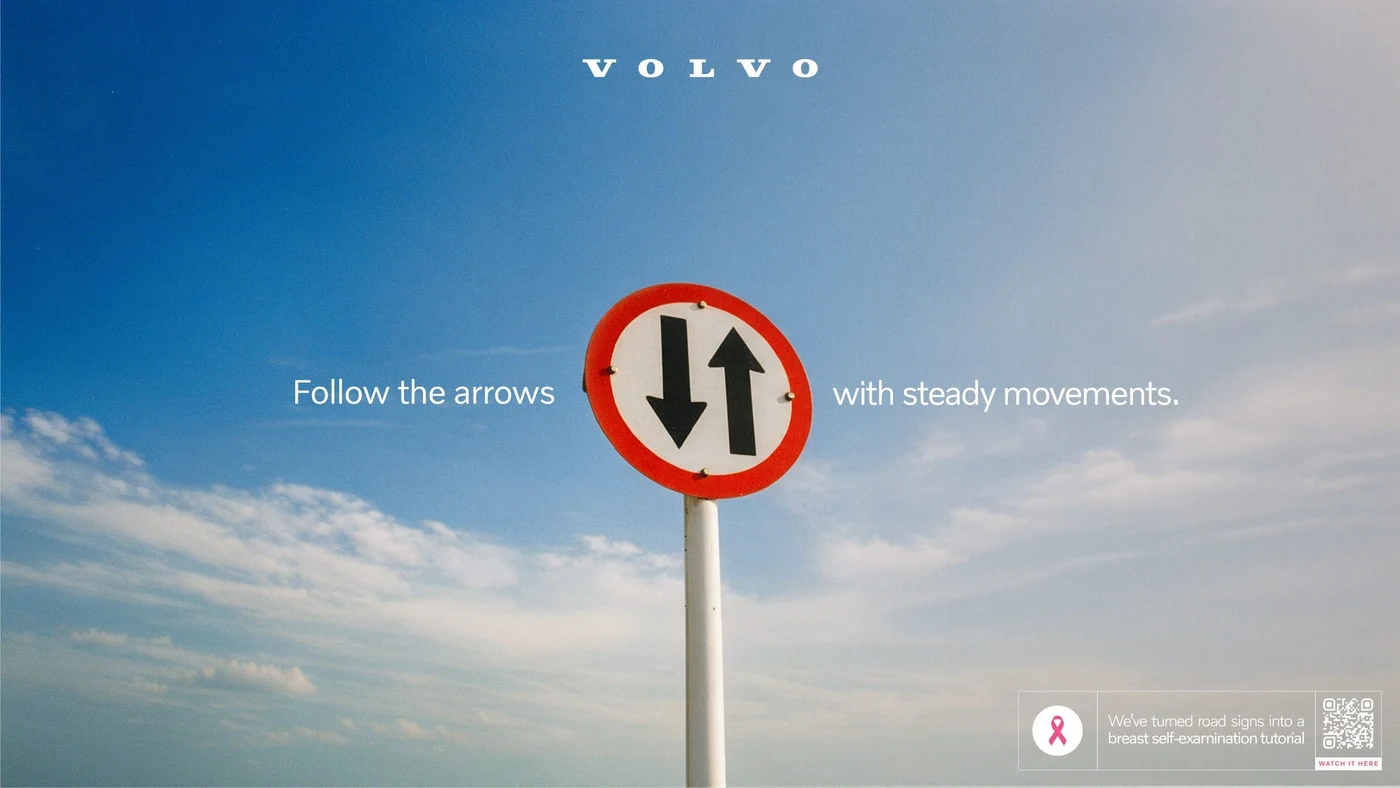
The visual idea opens into a detailed narrative
The series was adapted for print media and social media; it was supported by influencer collaborations and press work. A QR code on each poster leads to a video explaining the movements in more detail. Thus the sign doesn't remain just an attention-grabbing analogy; it becomes a gateway to the information that follows.
The small signature that unites the six works continues the same language. The pink ribbon sits inside a white area that carries the shape of the sign used in each poster. Whether the shape is a circle, triangle or octagon, the campaign's vocabulary doesn't leave the road. A complex health topic becomes readable in seconds thanks to familiar forms.