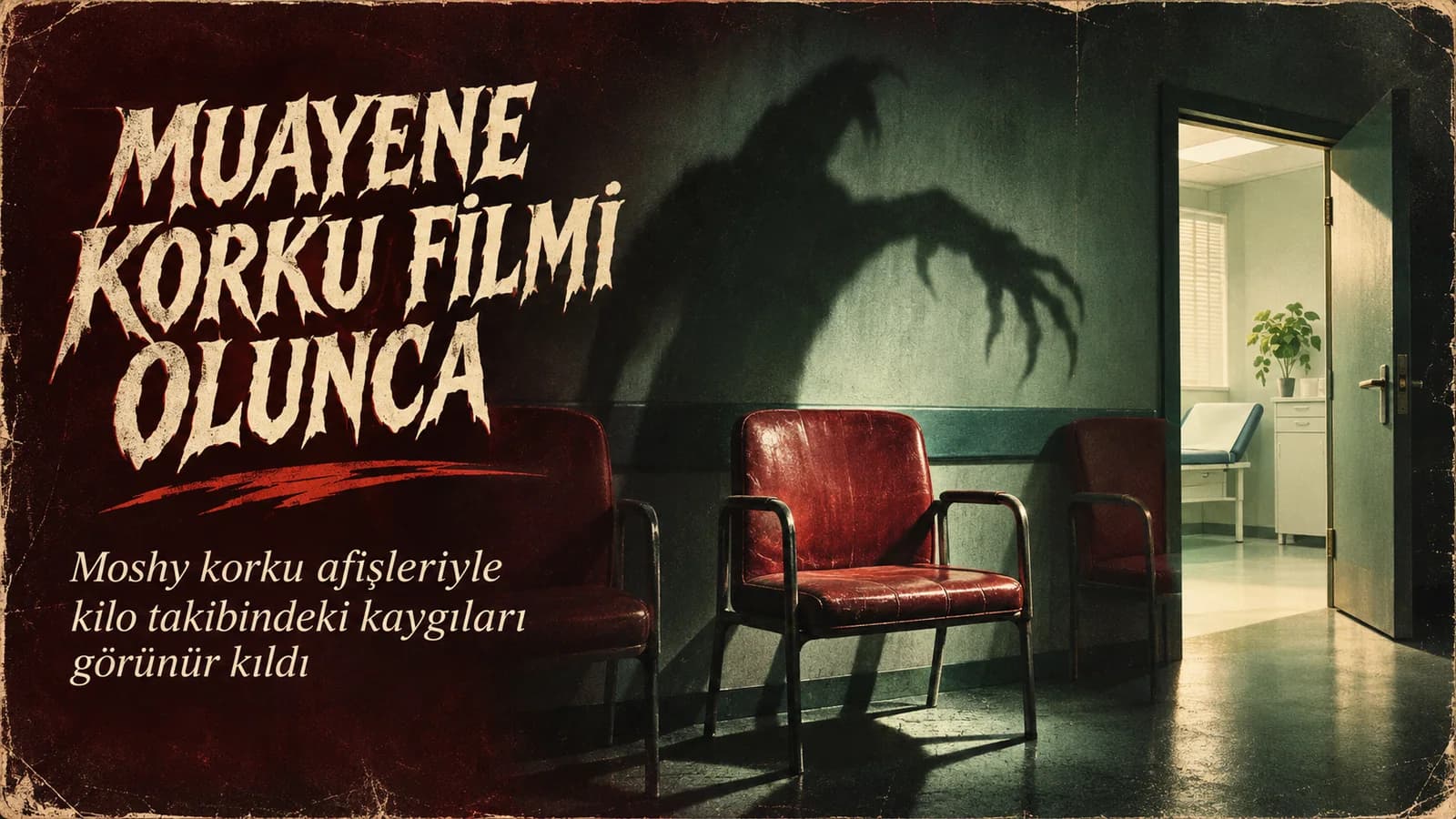
Weight management communication can easily slip into embarrassing language or exaggerated promises of success. Australian telehealth platform Moshy tackles this risky area in its Halloween poster series using the language of horror cinema. But the target of fear is not the body; it's making an appointment, asking for help, and not knowing what you'll encounter in the process.
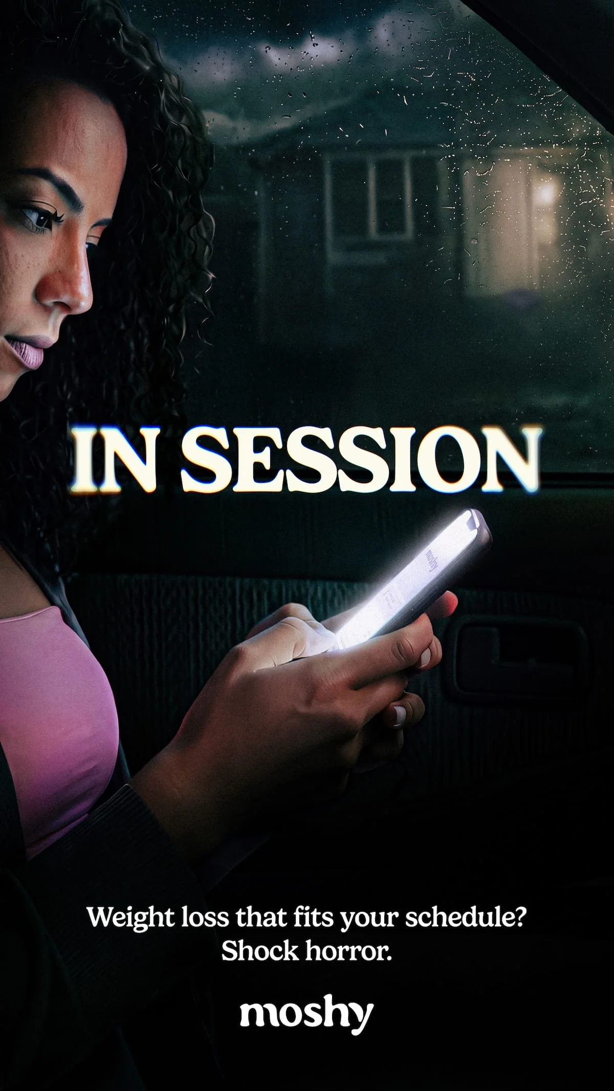
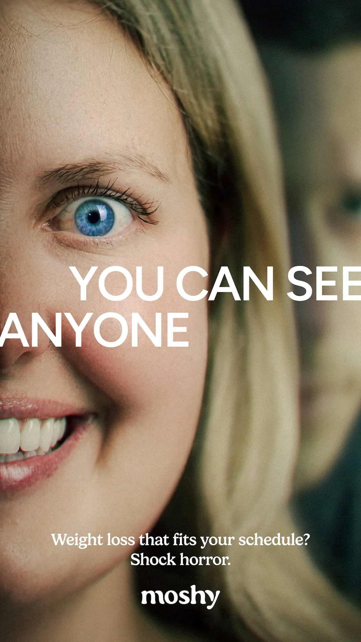
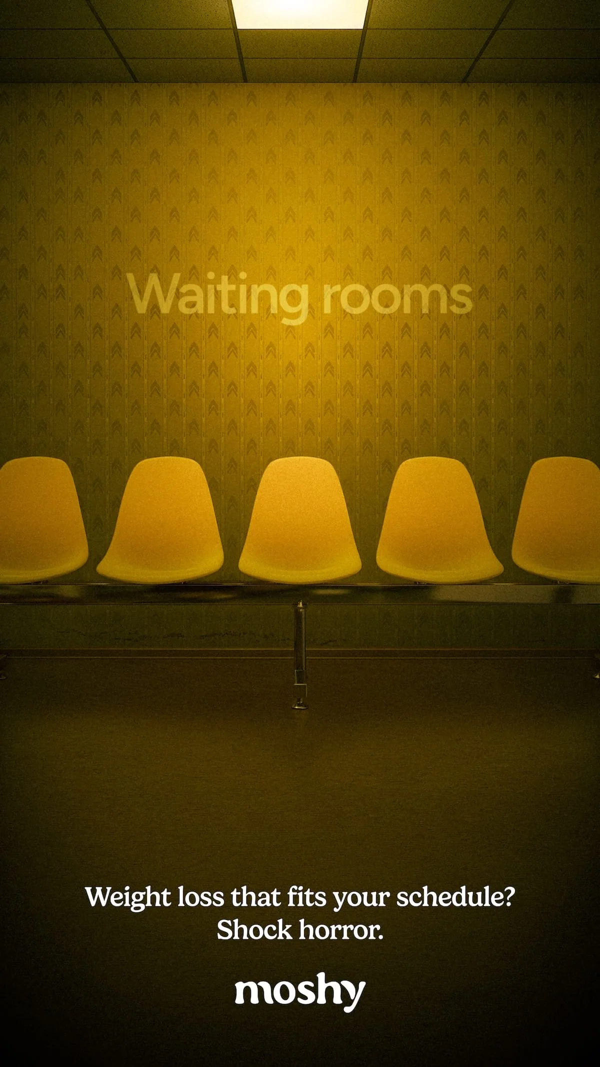
Published in Sydney, the series resembles posters for fictional horror films like Obsession, Backrooms, and You Can See Everything. Dark corridors, threatening framing, and eerie typography amplify the everyday anxieties of accessing healthcare.
When the target of the joke changes, so does the tone
The campaign does not make a direct promise of results for weight loss. Instead of turning bodies into before-and-after images, it looks at the emotions in the service experience. The idea of talking to a doctor, the waiting room, uncertain processes, and the anxiety of being visible all transform into familiar horror film tropes.
This choice also changes the direction of the humor. The viewer is not told to "fear yourself"; rather, it's an invitation to recognize together the eerie aspects of the system you encounter when seeking help. This seemingly small distinction in health communication keeps the campaign away from a language that blames people.
The advantage and risk of 72-hour production
Moshy's in-house team completed the work within 72 hours from first sketch to delivery. The creative team included Jonathan Seidler, with design by Tonyteni Taulaga and art direction by Eamon Hayward; Olivia Whiting, Lee-Helena Rosolen, and Fourteen10 also contributed to the execution. The short production time allowed the campaign to enter the Halloween conversation in a timely manner.
Speed also carries a risk in such sensitive topics. While horror aesthetics easily attract attention, they may risk trivializing the healthcare experience. Moshy's solution is to direct the humor not at the person's weight but at the frictions in the process. The fact that the posters do not claim a specific weight loss result or treatment superiority also sets the boundary of the narrative.
Genre codes work even without explanation
To understand the series, you don't need to know every film the posters reference. Dark lighting, large headlines, and tense composition immediately establish the "horror film" feeling. The brand's message also builds on these familiar codes: In weight management, the real scary thing shouldn't be asking for help.
Ultimately, the campaign walks the line between making healthcare look like a horror film and belittling the service. The most accurate creative decision is to draw this line through the experience, not through bodies. Moshy stands out from most ads in the category by discussing emotion before measurement and results.