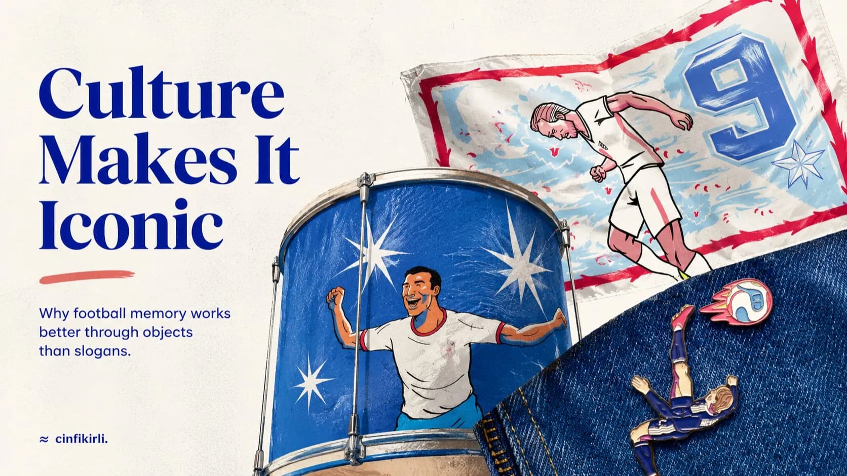
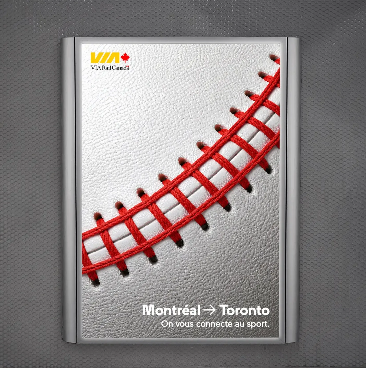
You look at a baseball, and most of the time, you just see a baseball.
Red stitches, white leather, a mildly nostalgic sports object. That's it. A creative team looks at the same ball and sees a train track. A brand manager looks at the same ball and sees a route from Montreal to Toronto. A fan looks at the same ball and sees the ghost of a team from their childhood.
That's where a good idea sometimes comes from.
No, not from a big production.
No, not from a long manifesto.
No, definitely not from some half-baked brand line that starts with "a travel experience that brings people together."
It comes from catching the second meaning already sitting inside an object.
VIA Rail's work, signed by Cossette, does exactly that. Canada's train company uses a visual that turns the red stitches of a baseball into train tracks, centered around a special game honoring Vladimir Guerrero Jr. for the Toronto Blue Jays. The context: Guerrero Jr. is being honored in a Montreal Expos jersey; the Expos are the baseball team Montreal lost in 2004, a void still lingering in the city's memory. VIA Rail uses this moment to connect Montreal's baseball passion to the game-day experience in Toronto. The campaign was prepared to run for two weeks across outdoor and digital channels.
So what's the point?
The point isn't "they made the ball look like tracks." That's the surface level. The real point is this: The brand reminds you of its service without talking about its service.
A good visual idea doesn't need an explanation
Some work can't stand on its own without an explanatory text.
You see the visual. Then you read the headline. Then you read the subtext. And it still doesn't quite click. Then the voice-over in the agency's case film kicks in: "We were inspired by the passion for travel within people..."
Okay, but where's the visual?
With VIA Rail's baseball idea, the situation is reversed. The visual works first, the text comes later. In fact, the idea works even without the text. The ball's stitch becomes a track. The track connects two cities. Two cities meet over a shared baseball feeling.
That's why what Cossette art director Marie Cermakova said is important: They wanted to create "a visual that could tell the story without words." The sentence is short, but it reads like a brief. Because that's the whole test of this work.
Can it tell the story without words?
Yes, it can.
But while doing it, the brand doesn't overexpose itself. It doesn't shout the logo. It doesn't put a giant train in the picture. It doesn't spew features like "comfortable, safe, practical travel." It shows the track inside the ball and steps back.
This stepping back takes courage. Most brands can't stop there. They'd say, "But where will the train appear?" "But how will they understand the product benefit?" "But shouldn't the logo be a bit bigger?" Then the idea slowly dies in the meeting room.
What happened just now?
The brand couldn't trust the idea. It offloaded the weight the idea could carry onto brochure text.
This campaign plays on absence, not nostalgia
The Montreal Expos thing isn't ordinary sports nostalgia.
Some cities have teams they've lost. The team is gone, but its colors remain. The jersey remains. The old players remain. The stories of games attended as a child remain. The memory around a stadium remains. The city tries to fill that void with other things, but it never quite fills it.
VIA Rail isn't saying "baseball lovers should go to Toronto."
It's doing something more subtle.
"There's a baseball feeling still alive in Montreal. That feeling takes the stage in Toronto today. We are the line in between."
I call this the "void route."
Definition: A brand connecting an unfulfilled emotion in people's lives with a physical route.
Here, the void is Montreal's lost team. The route is Montreal–Toronto. The emotion is the Expos memory built through Guerrero Jr. VIA Rail combines these three pieces in a single visual.
That's why this work isn't just a transportation ad. Or rather, this is what a good transportation ad looks like. It doesn't say it takes you from point A to point B. It reminds you why you want to go to point B.
RyanAir has turned the cheap flight idea into a reckless personality on social media for years. Eurostar tries to connect two cities not just by distance, but as a lifestyle. Patagonia, while selling products, amplifies the idea of taking a stance towards the world, not just the idea of climbing a mountain. Liquid Death packages water like a metal concert. Martı tries to frame transportation not just as a vehicle-sharing issue, but as a debate on urban mobility freedom.
They all have the same thing.
The product alone isn't enough. You need the tension, longing, irritation, habit, or void the product connects to.
VIA Rail also transforms the train from a vehicle running on tracks into the line connecting to Montreal's baseball void.
Outdoor advertising still demands single-glance wit
Outdoor advertising has a cruel side.
No one stops to pay respects to your billboard. No one says, "Let me pause for a minute to decode this brand's strategic message." People walk by. Cars drive by. The metro passes. Eyes pass.
You have a few seconds.
In those few seconds, you either catch them or you become background.
That's why most work trying to look too clever outdoors falls flat. Because cleverness puts a workload on the audience. It says, "Figure it out." The audience has their own stuff to do. They don't have to solve your metaphor.
VIA Rail's work strikes a good balance here. The stitch on a baseball is already linear. A train track is also linear. The similarity isn't forced. The eye catches the transformation quickly. Then the context kicks in: Blue Jays, Guerrero Jr., Expos, Montreal, Toronto.
First the visual.
Then the memory.
Then the route.
Then the brand.
That's the order.
Most campaigns set this order backwards.
First the brand. Then the product benefit. Then the campaign message. Then the visual. Then a bit of emotion. And they put the user at the very end. That's why it smells like an ad. That's why people aren't stunned when they see it. That's why it doesn't get shared. That's why no one remembers it two days later.
Here, VIA Rail sees the user not as a "train passenger," but as a "Montreal baseball person who wants to go to the game." The difference is huge.
You sell a ticket to one. You give a reason to the other.
Sometimes a brand should show the path, not itself
The common sin of transportation brands is this: They always talk about the vehicle itself.
Seat comfort. Arrival time. Safety. Punctuality. Price. App convenience. Luggage allowance. Campaign code.
All of these are important. But they are not the brand's idea. They are purchase reasons. There's a difference.
What is your brand's idea?
No, it's not that you're fast.
No, it's not that you're comfortable.
No, it's not your promotional ticket.
No, it's definitely not your sentence "we care about customer satisfaction."
Your brand's idea is which behavior, emotion, or habit in people's lives you connect yourself to.
Here, VIA Rail speaks against the "car instead of train" reflex. This is also in Philippe Normand's explanation: He says fans wanting to go from Montreal to Toronto for the game still think of the car first, while the train is a simpler and more comfortable option.
This sentence is strategically important.
Because the brand chooses an enemy for itself: the car reflex.
What I call an enemy doesn't have to be another brand. Sometimes it's a habit. Sometimes it's laziness. Sometimes it's the sentence "we always do it this way." Sometimes it's opening Google Maps and choosing the car without thinking.
A good campaign pokes at this automatic behavior.
It doesn't say "don't take the car."
It says "the track is already there for baseball."
More elegant, less teacher-like, less like a public service announcement.
Lesson for the global industry: don't plan media before finding the symbol
I won't make up a Turkish equivalent transportation campaign name. I don't recall a clear local example that perfectly matches this case. So it's cleaner to state the lesson for the global industry.
Brands often put the media plan before the idea.
"Let's do outdoor."
"And a digital adaptation."
"Can we make a Reels version?"
"We'll share it on game day."
"Let's give a ball to an influencer too."
"We can tell it like a case study on LinkedIn."
Sound familiar?
Distribution is being discussed before the symbol is even found. A format list is being made before the campaign has a heart. Media is being bought before the question "why would anyone care about this?" is answered.
That's not strategy, that's just arithmetic.
Strategy finds the right knot first. The knot here is: Montreal lost baseball, but it didn't lose the baseball feeling. That feeling takes the stage again in Toronto. VIA Rail provides the physical connection between the two cities.
Then the creative idea comes: Let the ball's stitch be the track.
See, the order matters again.
First the cultural void.
Then the route.
Then the object.
Then the visual.
If it were the opposite, it would be a cute but empty visual exercise starting with "let's make a train track out of a baseball." That's what we see a lot on social media today. Objects are made to resemble each other, but there's no idea. A coffee cup is turned into a planet. Shoelaces are turned into a road. A hamburger is turned into a city skyline. Cute at first glance. Empty at second glance.
VIA Rail's work isn't empty because it has context.
Where is your brand's ball stitch?
The real question of this work is: What is the second meaning already sitting inside your brand that no one sees?
If you're a bank, are you just moving money, or are you making people's postponed decisions visible?
If you're a transportation brand, are you just selling routes, or are you giving access to things people miss?
If you're a food brand, are you just talking about taste, or are you owning the small rituals at home?
If you're a tech startup, are you just listing features, or are you finally making a task people couldn't do, doable?
A good brief starts here.
"Let's get attention on social media" is not a brief.
"Let's reach young people" is not a brief.
"Let's create brand awareness" is not a brief.
These can be goals. They are not a brief.
A brief is the question that forces you to see the track in the ball's stitch.
VIA Rail saw it. Cossette simplified it. The Blue Jays and Expos memory provided the emotional ground for this simple idea. That's why the work works.
Because the campaign reminds us: Sometimes the best ad isn't the brand talking about itself; it's hiding the brand's path inside an object people already know.
What is the object in your industry that everyone looks at but no one sees the second meaning of?
Without finding that, you're not running a campaign; you're just filling media space.