During the World Cup, flags don't just wave in the stands. They hang in home windows, stick to car backs, appear on balconies, turn into social media visuals, and settle into fans' everyday lives.
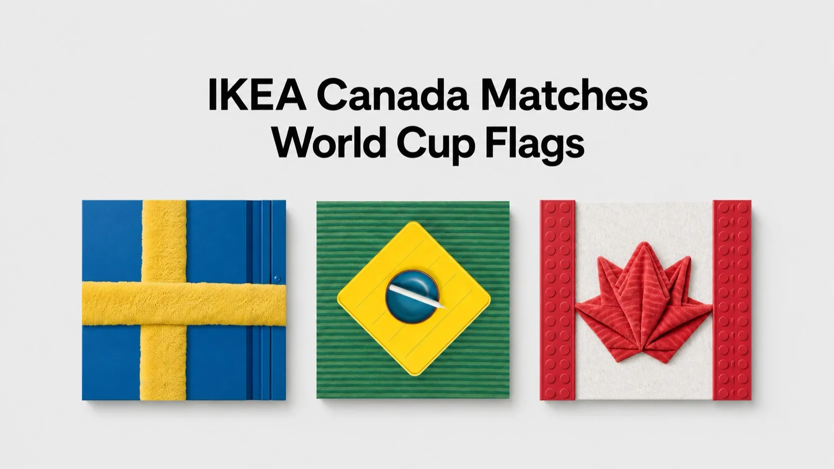
IKEA Canada's "Bring the World to Life" campaign takes this familiar fan behavior into the brand's own product universe. Instead of using classic graphic design elements, the campaign rebuilds different countries' flags with IKEA products.
Furniture, lamps, decorative objects, plush toys, and lifestyle accessories come together. The result is visual compositions that read like flags but consist of individually purchasable products.
In other words, the campaign doesn't just say "we made flags for the World Cup." It transforms the flag itself into a product arrangement open to shopping, sharing, and rebuilding at home.
What does the campaign do?
"Bring the World to Life" creates flags for 18 countries using different IKEA products. Each flag is assembled from pieces in the brand's product catalog. Sometimes a sofa becomes a color block, sometimes a lamp fills the flag's empty space, and sometimes a toy or accessory works like a small graphic element.
This approach does two things at once.
First, it uses the flag as a fan symbol. During major tournaments, people embrace their country through flags, colors, jerseys, and symbols. IKEA brings this sense of ownership into the home.
Second, it directly ties the campaign to shopping. The products seen in the visuals aren't just decorative elements. Users can browse them, buy them, and recreate a similar flag composition in their own homes.
That's why the work sits somewhere between a social media visual and a product showcase.
Where does the idea work?
Where the campaign works is in connecting World Cup excitement to in-home behavior.
Football tournaments are usually told through stadiums, bars, squares, broadcast screens, and social media. IKEA, however, stays true to its own space: the home.
Where the fan watches the match, who they watch with, how they prepare their home, which colors they use, and how they make their country visible at home—these are at the heart of the campaign.
This is a choice that fits the brand's natural territory.
For IKEA, owning the World Cup isn't about talking football; it's about showing how football enters the home. And the campaign does that through products.
At first glance, the flag visual carries fan emotion. Up close, it turns into an IKEA catalog. This double layer strengthens both the shareability and the shopping-driving side of the work.
Why does the Canadian context matter?
Canada, with its multicultural makeup, is a country where communities from different backgrounds live together. Major international tournaments like the World Cup are times when this diversity becomes visible.
People express not just the country they live in, but their family history, birthplace, supported teams, and cultural ties through flags. Multiple countries' excitement can live in one home at the same time.
That's why the campaign doesn't build a single national narrative. Instead, it brings different countries together within the same product language. Each country's flag is redesigned within the same brand universe. This ties the campaign not just to football fandom, but to the sense of cultural diversity in Canada.
"Home" here isn't just a physical space. It's also linked to where a person comes from, the country they support, and the cultural space they feel they belong to.
How can brands in Turkey read this?
For brands in Turkey, this idea is valuable not as a directly copyable flag application, but as a way to think about the in-home fan experience during major tournaments.
Communication built around the Turkish National Team often converges on similar phrases:
"Good luck Turkey."
"Our hearts are with you."
"Come on, our boys."
These messages aren't wrong. But when many brands use the same language during a tournament, content starts to look alike.
What the IKEA Canada example really shows for Turkey is this: National excitement can be told not just with slogans, but with everyday objects.
A food brand could focus on the match table, a tech brand on the second-screen experience, a retail brand on red-and-white home prep, a home living brand on balcony and living room setups, a transportation brand on match-day city mobility.
In other words, a brand can enter the national team agenda not just with a "support message," but through how the fan actually experiences the match.
Adaptation idea for the Turkish National Team
If such an approach were built in Turkey, the center of the work shouldn't just be the flag visual, but match-watching rituals.
Red-and-white table settings.
A match-watching corner in the living room.
Small details hung on the balcony.
Preparation with a group of friends.
The screen setup at the family home.
The pre-match triangle of tea, snacks, jersey, flag, and phone.
Communication for the Turkish National Team can find a more local and more authentic space when it speaks from within these rituals.
For example, instead of directly turning products into flag forms, a brand could start from the question "what changes at home on match day?" Small details like red-and-white objects in the home, the fan's state of preparation, products on the table, excitement in group chats, and post-match mess could carry the campaign.
In such an adaptation, the key point is not to reduce national symbols to just a sales opportunity. The flag, jersey, and national team feeling carry high sensitivity. So the brand language should appear neither too artificial nor too commercial.
The sweet spot is less about using the symbol and more about understanding the fan's everyday behavior.
What does it get right?
The campaign reads the World Cup not just as a match schedule, but as a way for people to express themselves.
Here, the flag isn't just a graphic on its own. It's a sign of belonging. One of the ways a fan says "I'm here," "I support this," "I'm part of this story."
When IKEA Canada brings this symbol into its own product universe, it doesn't abandon the brand's core territory. It doesn't try to tell football stories or own the game on the field. Instead, it looks at the world the fan builds at home.
That's why the campaign doesn't feel like something pasted onto the sports agenda from the outside. It reads the World Cup through home, products, living spaces, and personal belonging.
Lessons for brands in Turkey
The key lesson for Turkish brands is this: Major tournaments aren't just opportunities for "celebration posts."
The Turkish National Team agenda creates many small behaviors in people's daily lives. Match-watching prep, outfit choices, meal planning, meeting up with friends, score-checking at work, setting up screens at home, stepping onto the balcony, post-match commentary...
Each of these behaviors can open up a more authentic communication space for brands.
What matters isn't putting a logo on top of national excitement; it's understanding the moment that excitement is lived in.
What IKEA Canada does is close to that. It takes the flag and doesn't just use it as a visual decoration. It combines it with products, home, and fan behavior.
An adaptation that works well in Turkey could similarly start not from the field, but from the home.
Because big matches aren't just played in the stadium.
They're also lived at home, at the table, on the balcony, on the phone, and in group chats.


